UX Researcher

Project 2: Product Design & Evaluation of Gather'd
This project focused on the early stages of product design for 'Gather’d,' beginning with literature reviews, competitive analysis, surveys, first-click tests, and later evaluated through usability testing and interviews
Conducted via DePaul University
Project Timeline:
Project Type: Product Design & Usability
Primary Tools: Qualtrics, Figma, TurboScrube, and Proven by User
My Role: Team Lead & Researcher
Duration: 8 weeks
Project Overview
Background: What is 'Gather'd'?

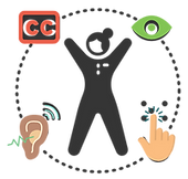
Gather’d is a digital directory app designed for residents (older adults, 55+) and visitors of residential care communities (RCC). It helps users easily access community information, boost resident engagement in activities, and build stronger connections, all through accessible kiosks and mobile devices.
Gather'd was inspired by a teammate’s firsthand experience with disorganized communication at their grandmother’s RCCs.
Problem:
Many RCCs struggle to meet residents' engagement and communication needs partially due to outdated communication systems, which has led to:

Research Questions:
To better understand these issues, we outlined the following research questions to guide this study.
What accessibility issues do users encounter when using digital tools to access community and social information?

What design elements help users feel confident in navigating and using the app independently?

Which features and content types are most likely to increase engagement and satisfaction with RCC communication systems?
Goals:
Guided by the research questions, this project aimed to:

My Process:
In this project, I took an active leadership role and contributed across all stages of the process.


Understanding the Problem
Tip: Click the images in the slider to enlarge them.
Methods- Literature Review:
To ensure Gather'd's designs were based on real user needs and accessibility best practices, a review was conducted of numerous scholarly research studies focused on older adults’ tech use, accessibility needs, and social connection, with a particular focus on design for kiosks and mobile devices.
This approach helped us prioritize features that support usability and social connection in RCC settings by grounding decisions in proven engagement strategies for aging populations.
Findings- Literature Review:
The review revealed the following insights about older adults’ digital use and accessibility needs:

Slide titled Theme 1: Barriers to technology use go beyond age. It explains that older adults often face cognitive, sensory, and motor challenges (such as memory issues, vision loss, or limited mobility) that affect their ability to use digital tools. The text highlights that resistance to technology is more often caused by poor design and unfamiliar interfaces than by age alone.

Slide titled Theme 2: Accessibility gaps in kiosk & mobile design. It notes that older adults prefer kiosks for simplicity, but many kiosks lack accessibility features like adjustable text, clear icons, and voice support. The text emphasizes the need for intuitive, low-effort interfaces that accommodate age-related changes and allow easy error recovery.

Slide titled Theme 3: Community connection supports well-being. It explains that a strong sense of community benefits the emotional and cognitive health of older adults, while social isolation negatively impacts well-being. The text stresses that thoughtfully designed technology can foster connections, encourage engagement, and promote belonging in residential care communities (RCCs).
Slide titled Theme 1: Barriers to technology use go beyond age. It explains that older adults often face cognitive, sensory, and motor challenges (such as memory issues, vision loss, or limited mobility) that affect their ability to use digital tools. The text highlights that resistance to technology is more often caused by poor design and unfamiliar interfaces than by age alone.
Methods- Competitor Research & Analysis:
To better understand Gather'd's market position, a comparison of 3 existing competitors (LifeLoop, S.M.A.R.T Technologies, and Activity Connection) was conducted to identify gaps and opportunities in the current market.
These insights informed both the functionality and design direction of 'Gather’d, and they ensured our designs offered unique value while building on proven solutions.
Findings- Competitive Research & Analysis:
This method revealed the following gaps in the market and opportunities for Gather'd:

Methods- Survey:
To better understand user needs, a survey was launced to gather both quantitative and qualitative feedback from 81 participants who currently reside or have visited an RCC. The survey explored: communication satisfaction, accessibility issues, feature and device preferences, and community engagement.
I conducted an independent cross-tabulation and thematic analysis on open-ended responses to identify key trends among respondents. I also calculated the Net Promoter Score (NPS) to quantify satisfaction levels of preferred features and current communication tools. This process enabled us to capture diverse user experiences and feature preferences, defining user archetypes and prioritizing solutions that addressed communication and accessibility barriers.
Findings- Survey (Cross Tabulation):
Our quantitative results confirmed widespread communication and accessibility issues.

The (NPS) revealed the following:
.png)
Findings- Survey (Thematic Analysis):
The open-ended responses uncovered key trends about accessibility and usability:

Methods- First Click Tests:
To further evaluate usability, a one-round first-click test was conducted to assess the clarity and usability of our low-fidelity prototype. Participants were recruited through professional connections and other online channels, and were shown prototype images to complete four important and typical tasks of our intended audience.
Task success was based on initial click accuracy and user confidence. This approach enabled us to explore whether users could intuitively locate key features at first glance, which helped us refine labels, button placement, and navigation flow before conducting usability testing.
Findings- First Click Tests:
The click tests revealed where users easily found actions and their struggles:

Usability Tests & Interviews:
Building on the click test, one-round of usability testing and interviews with participants were conducted to assess the functionality and intuitiveness of the mobile device design.
Due to time constraints, our designers created a mid-fidelity prototype with limited functionality compared to a high-fidelity version. As a result, we excluded the 'Adjusting Text Size' task and tested the remaining tasks from the first-click test.
Following the completion of the click test, a brief interview was facilitated using multiple 5-point scales (Strongly Disagree to Strongly Agree, and Very Difficult to Very Easy) to assess ease of use, learning, and user satisfaction. Once the interviews were completed, we utilized AI tools to transcribe the interview transcripts, and then convened as a group to perform a thematic analysis using open coding.
These methods provided direct insight into how users interact with our design, revealing usability issues and guiding actionable refinements to enhance task flow and user confidence.
Findings- Usability Tests & Interviews:
Particpants' feedback revealed the following insights:

A theme slide titled “Theme 1: Key information was hard to find due to unclear navigation and hidden content.” Below, a teal banner with star icons reads: “All participants struggled to locate important features and details, such as event times or resident profiles, due to confusing labels and tab names, as well as missing or buried content, which disrupted task flow and led to uncertainty.”

A theme slide titled “Theme 2: Poor visual cues limited interaction with key elements.” Below, a red banner with star icons reads: “The majority of participants hesitated to interact with elements due to unclear buttons and inconsistent styling.”

A theme slide titled “Theme 3: Multi-step flows increased cognitive load and hesitation.” Below, a red banner with star icons reads: “Most participants found tasks with more than 3 steps mentally tiring or confusing, which left them unsure of what to do next, requiring them to ask for help.”
A theme slide titled “Theme 1: Key information was hard to find due to unclear navigation and hidden content.” Below, a teal banner with star icons reads: “All participants struggled to locate important features and details, such as event times or resident profiles, due to confusing labels and tab names, as well as missing or buried content, which disrupted task flow and led to uncertainty.”
Impact & Next Steps
Tip: Click the images in the slider to enlarge them.
Actionable Reccomendations:
Based on insights from all testing methods, we developed actionable recommendations to address major user pain points.

Circular infographic with the text “Make interactive elements clear, recognizable, and consistent.” On the right, supporting recommendations: Redesign buttons and icons with recognizable shapes, outlines, borders, or tap effects to make them visually obvious and clickable. Add on-screen hints, such as button highlighting or slight bounce, to show when a tap or press is registered.

Circular infographic with the text “Improve menu labeling and navigation clarity.” On the right, supporting recommendations: Use simple, familiar labels and clear icons. Use large, touch-friendly icons next to text in menus to make scanning easier for users with lower vision.

Circular infographic with the text “Highlight and centralize high-traffic content.” On the right, supporting recommendations: Display daily essentials (e.g., meals, events, announcements) with banners, new badges, or icons at the top of the home screen. Provide reminders and notifications to encourage residents to check important updates.
Circular infographic with the text “Make interactive elements clear, recognizable, and consistent.” On the right, supporting recommendations: Redesign buttons and icons with recognizable shapes, outlines, borders, or tap effects to make them visually obvious and clickable. Add on-screen hints, such as button highlighting or slight bounce, to show when a tap or press is registered.
Ongoing Opportunites:
This project revealed valuable insights and design opportunities, along with essential lessons and limitations to inform future work.
