UX Researcher

Project 1: User Experience Audit & Usability Testing for Alternative Teaching Strategy Center
This project evaluated Altteaching.org through heuristic review, cognitive walkthroughs, usability testing, and interviews.
Conducted via DePaul University
Project Timeline:
Project Type: UX Audit & Usability
Primary Tools: Mural & Canva
My Role: Researcher
Duration: 8 weeks
Project Overview
Background: What is the Alternative Teaching Strategy Center (ATSC)?
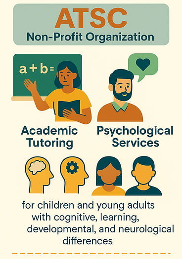
ATSC is a non-profit organization that provides academic tutoring and psychological services for children and young adults with cognitive, learning, developmental, and neurological differences.
We chose to evaluate ATSC’s website based on a personal connection with the founders, who voiced ongoing concerns.
Problem:
Despite ATSC’s valuable services, its site posed several usability concerns that prompted a deeper investigation.

Research Questions:
To better understand these issues and pinpoint specific areas for improvement, the following research questions were developed:

How easily can users locate and understand ATSC's enrollment process?

What paths do users take to learn about ATSC's teaching methods and services?

How well does the site’s structure and navigation align with users’ expectations?

How easily can users find how to donate to ATSC?
Goals:
These research questions guided our investigation and shaped the goals of the project:

My Process:
In this project, I was involved in all stages:


Understanding the Problem
Tip: Click the images in the slider to enlarge them.
Methods- Cognitive Walkthrough:
Our methods began with a one-round solo cognitive walkthrough, with three tasks influenced by our research questions. Each task simulated how a new user would perform key actions related to the problem statement.
This approach allowed us to assess the site’s usability based on authentic user needs and concerns from ATSC. Each step for each task was evaluated using a customized measure based on a 5-point severity rating scale (1 = no issue to 5 = critical issue) across the following criteria: Learnability, Comprehension and Success rate, and Error frequency.
Findings- Cognitive Walkthrough:
The following was uncovered for each task:

Methods- Heuristic Review:
Another research method utilized to evaluate ATSC's site usability was a heuristic review. This method consisted of a one-round evaluation using Nielsen Norman Group’s Heuristic Guidelines and a 5-point severity rating scale (1 = no issue to 5 = critical issue), to explore navigation, layout, and structure.
This evaluation enabled us to prioritize user pain points, identify actionable design opportunities, and propose potential solutions to enhance learnability, efficiency, and overall satisfaction.
Findings- Heuristic Review:
Our team identified and ranked 47 heuristic violations that impact user experience. The top four guidelines violated were:

Methods- Usability Test & Interviews:
To gain real-world insights into the challenges revealed in the heuristic review, a one-round usability test and interview session were conducted. Participants were recruited through personal and professional connections. During testing, participants were asked to think aloud as they navigated the site to complete 4 tasks related to the problem statement.
After, a short interview was conducted, participants rated their experiences using multiple 5-point scales (Strongly Disagree to Strongly Agree, and Very Difficult to Very Easy.) The interview transcripts were then manually transcribed, and a group thematic analysis using open coding was performed.
This approach led to a deeper understanding of users’ expectations, preferences, and areas where they felt improvements could be made, allowing us to compare findings and uncover key themes across all participant interviews.
Findings- Usability Test & Interviews:
The following four themes were uncovered:

A red banner with stars and circles contains text: Most participants emphasized the need for a more human, inclusive site that reflects diversity in education, including representation from staff of various racial backgrounds.

A dark teal banner with stars and circles contains text: All participants relied on the 'Contact' page as a last resort when they couldn’t find the information they were looking for elsewhere on the site. Most expressed that key information did not “stand out.”

A red-orange banner with stars and circles contains text: All participants had trouble using the site because the text was hard to read, the navigation was confusing, and the content felt disorganized.
A red banner with stars and circles contains text: Most participants emphasized the need for a more human, inclusive site that reflects diversity in education, including representation from staff of various racial backgrounds.
Impact & Next Steps
Tip: Click the images in the slider to enlarge them.
User Profiles:
Based on usability tests and interview themes, two personas were developed to reflect the key user types: caregivers navigating special education and donors supporting these programs.

Their goals and challenges reveal key usability issues, reinforcing our focus on simplifying content, streamline decision-making, and make program details easier to access.

Their frustrations and needs reveal opportunities to build trust through stronger communication and clearer reporting on how donations are used, supported by proof of impact.
These archetypes helped shape our recommendations in real user goals and expectations.
Actionable Recommendations:
We used insights from all testing methods to develop several actionable recommendations that address key user pain points.
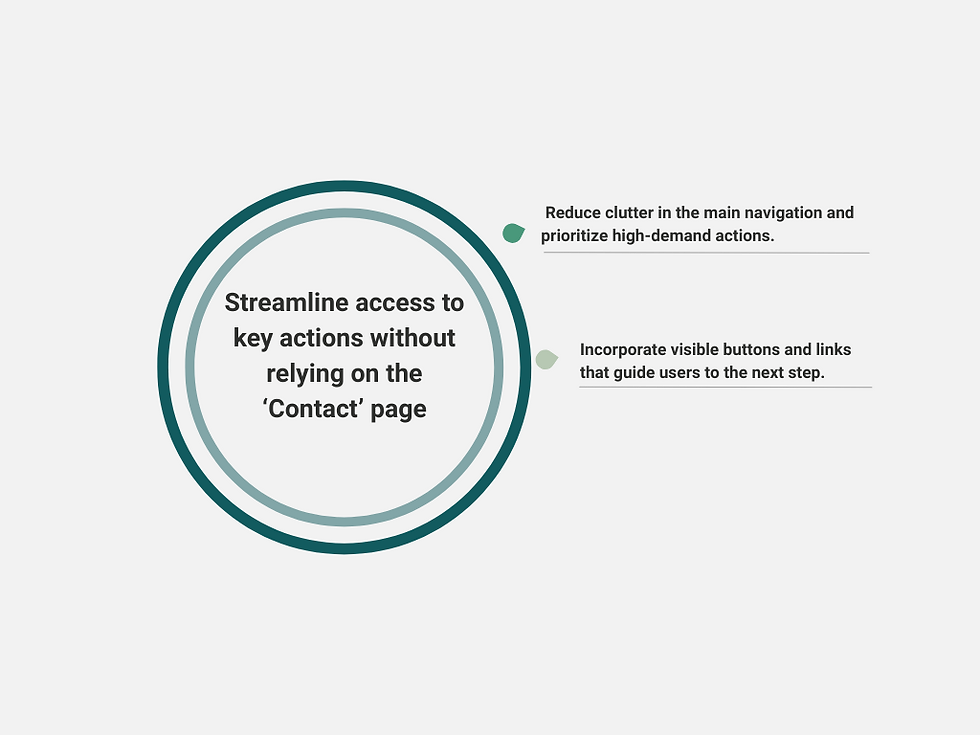
A circular graphic with the heading “Streamline access to key actions without relying on the ‘Contact’ page.” Two bullet points are shown on the right: Reduce clutter in the main navigation and prioritize high-demand actions. Incorporate visible buttons and links that guide users to the next step.

A circular graphic with the heading “Make donation options transparent with clear purpose and impact.” Two bullet points are shown on the right: Explain exactly where the money goes and how it supports the organization’s mission. Highlight outcomes and success stories to help donors connect emotionally and understand the impact of their contributions.

A circular graphic with the heading “Simplify and modernize the layout to improve readability and build trust.” Two bullet points are shown on the right: Refine categories by grouping related information to reduce content overload. Improve readability by using consistent, legible fonts, high-contrast colors, and clear spacing between paragraphs and sections.
A circular graphic with the heading “Streamline access to key actions without relying on the ‘Contact’ page.” Two bullet points are shown on the right: Reduce clutter in the main navigation and prioritize high-demand actions. Incorporate visible buttons and links that guide users to the next step.
Ongoing Opportunites:
While this project revealed valuable insights and design opportunities, we also identified a few limitations and lessons to help guide future work.
